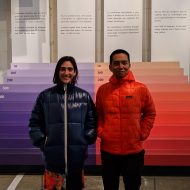

John Maeda: So why is typography an important element in Material Design?
Rachel Been: A majority of digital products and websites consist of typography. Type represents a high percentage of everything you see on the Internet. In order to make both the web and digital products more legible and enjoyable, it’s really important to get type right for the entire world.

JM: Which typeface do we have on display here in Saint-Étienne?
RB: We’re looking here at Roboto. Roboto is the system typeface for Android devices, and it’s also one of the most ubiquitous typefaces in use all over the world.

JM: I really love Noto because it covers so many languages, and I was wondering why Roboto doesn’t do the same?
RB: Noto is our answer for internationalization. That’s exactly what we made it for.
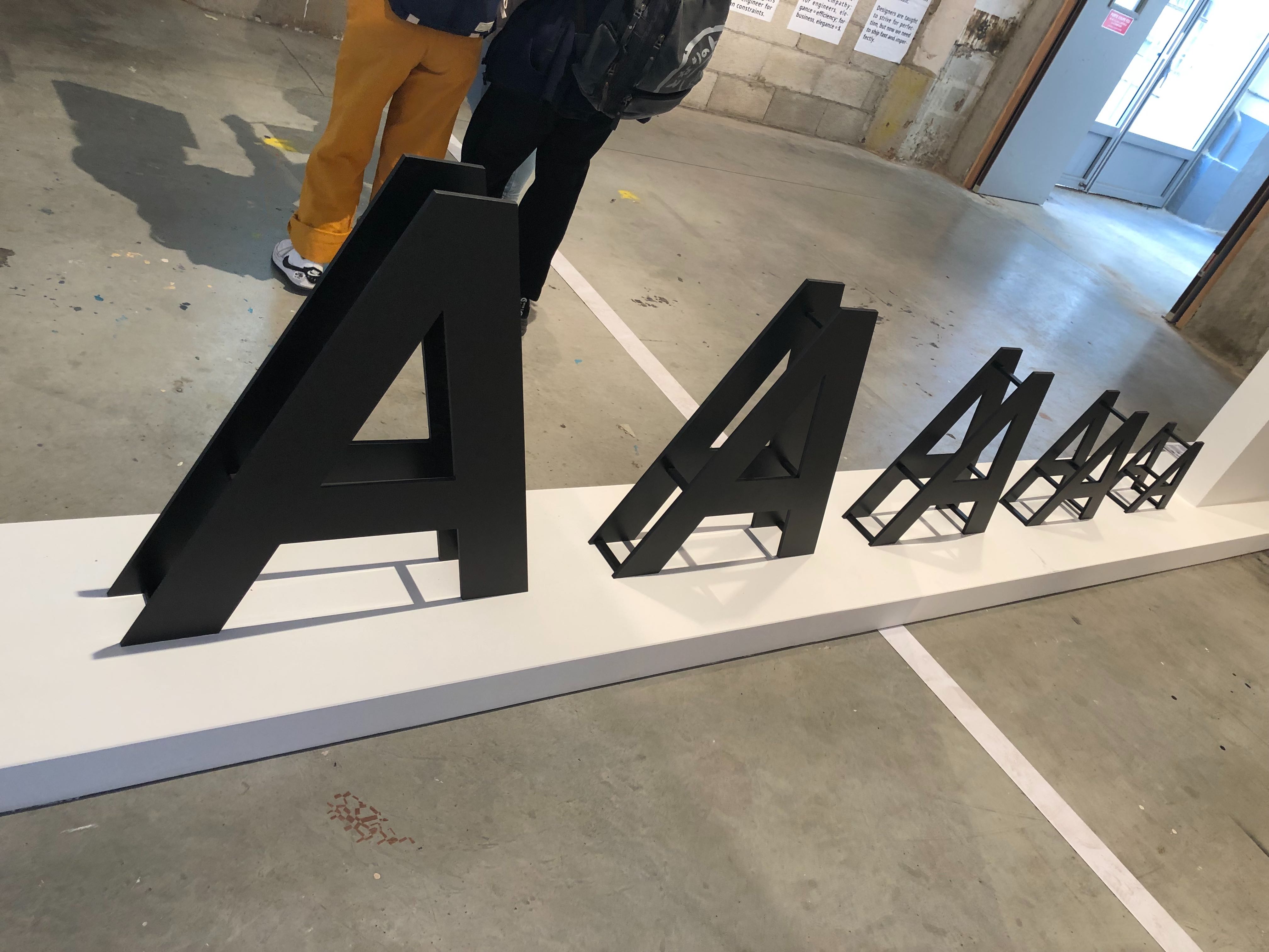
JM: Please tell me about typographic scales in Material.
RB: Typescales bring order to the interface, and there is an abundance of choices that you can make concerning different styles of typography. So what Material Design tries to do is create a curated set of typographic styles, and then teach the user how to understand what styles are appropriate for which user’s contexts. And it’s a really lovely thing to see when it gets well-constructed. We want to constrict the user to a smaller, curated set that can be used across a digital product while still having a wide variety of visual diversity available at the same time.

JM: In traditional book design you can use a grid, and the grid can match the typescales. On the Web, it gets a little dicey in how a 2D grid can operate. How do you solve that?
RB: We use a 4 DP scale for that. It’s used for our baseline grid so we can align the type elements vertically. It can be challenging the way that multiple platforms are constructed; it can be difficult across Android, across iOS, and across the Web just trying to maintain the same harmony with varying engineering constraints that differ depending on the platform.
JM: For older folks like me who can’t see as well … when I was younger, I used to set things in five points. I don’t do that anymore, and now I’ll up the accessibility settings for type sizes. But the behavior is often inconsistent across applications.
RB: System-wide accessibility settings allow you to dynamically change the type sizes. That’s why we need typography technology in the future that is really malleable, flexible, and reactive to different sizing needs. We want the operating system to react and changes in an intuitive, intelligent, and legible way. So hopefully in the future, things like variable typefaces will lead to more beautiful augmentation and dynamic sizing.


